When I got the task to test Delve.fun, I was genuinely curious. The platform is designed to make learning fun and interactive, and my goal was to make sure that the user experience matched that promise. It wasn’t just about finding bugs — it was about thinking like a real user while ensuring that everything worked as intended.
🔍 Getting Started
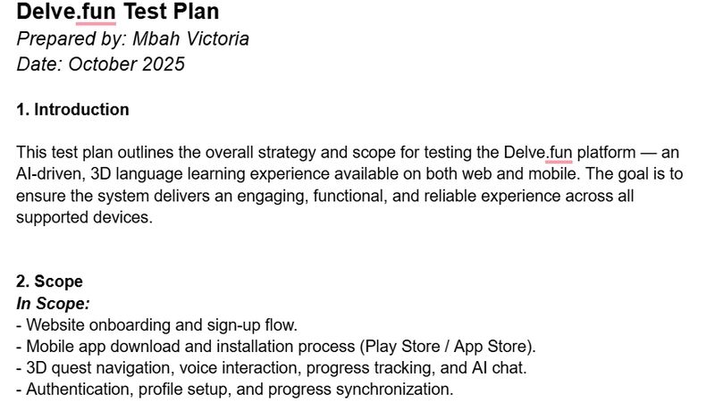
The first thing I did was review the Product Requirement Document (PRD) that explained the features and goals of Delve.fun. From there, I created a Test Plan to organize my process — outlining what I’d test, how I’d test it, and what success would look like.

Since Delve.fun is both a website and a mobile app, I tested it across desktop and mobile views to see how responsive and stable it was on different screens.
🧠 My Testing Process
I used a mix of manual and automated testing tools to get a complete picture of how the site performs. Here’s what I worked with:
🧰 Chrome DevTools to inspect console logs, network activity, and resource loading.
💡 Lighthouse to check accessibility, SEO, and performance scores.
♿ WAVE to identify accessibility issues like color contrast and missing alt text.
I also simulated a Slow 3G network to understand how the site performs for users with limited internet speed. It gave me a real sense of how load times and resource handling could affect user experience.

🪲 Reporting Bugs
Once testing began, I recorded everything in a structured Bug Report Sheet that included:
Bug title and description
Steps to reproduce the issue
Expected vs. actual results
Severity and priority levels

Some of the issues I found included:
- A missing or uninformative page title, which affected SEO and accessibility.
- An unsafe JavaScript evaluation warning in the console (potential security concern).
Each issue was documented with screenshots and clear notes to make it easy for developers to reproduce and fix.
⚙️ Non-Functional Testing
Beyond the visible bugs, I also explored non-functional aspects — the things users may not directly notice but that define how smooth the experience feels. Here’s what I focused on:
Performance: Load time and responsiveness.
Usability: Ease of navigation and mobile-friendliness.
Security: Authentication and data handling.
Reliability: Site uptime and behavior under stress.

💡 What I Learned
This project really helped me grow as a QA tester. I learned how to:
Combine manual exploration with automated testing tools effectively.
Write clear, useful documentation that helps developers act on feedback quickly.
Evaluate websites not just for functionality but also for accessibility and inclusiveness.
It also taught me that QA is not just about breaking things — it’s about building confidence that a product will give users a great experience every time.
💬 Final Thoughts
Working on this task for #HNGi13 has been such an eye-opening experience. It gave me hands-on exposure to real QA practices and helped me understand how small issues can have big impacts on users. I’m grateful for this opportunity and proud to have contributed to improving a product that focuses on learning and engagement.
Big thanks to @HNGInternship for this learning journey — it’s definitely a step forward in my QA career.