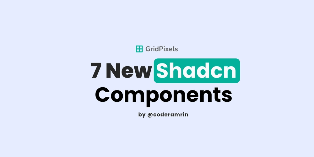
Shadcn just rolled out a major update, and it’s one of the most practical ones yet.
Seven new components were added, and they’re not flashy marketing pieces. They’re real app components designed to fix actual frontend pain.
If you’ve been using Shadcn for your dashboard, SaaS, or admin panels, you’ll love this.
These updates make everyday UI tasks simpler, cleaner, and more consistent.
Let’s get into it.
1. Spinner: Finally, a Built-In Loader
Every app needs a loading state, and now Shadcn has a simple, flexible one built in.
The new
<Button disabled>
  <Spinner className="mr-2" /> Loading...
Button>
You can even replace it with your own loader icon or animation.
2. Kbd: Show Keyboard Shortcuts Beautifully
helps you display keyboard shortcuts in a clean, accessible way. It’s perfect for command menus, power-user workflows, or tooltips.
<Kbd keys={["⌘", "K"]} />
Supports multiple keys, works inside buttons and menus, and brings that “Linear/Notion-level” polish to your UI.
3. ButtonGroup: Organize Your Actions
Stop manually styling button groups. Shadcn now has a
<ButtonGroup>
  <Button>EditButton>
  <Button>DeleteButton>
ButtonGroup>
You can even create split buttons by combining them with dropdowns.
4. InputGroup: Modern Inputs Made Easy
This one’s a game changer.
The new
<InputGroup>
  <Input placeholder="Search..." />
  <Button>GoButton>
InputGroup>
You can add prefix/suffix icons, tooltips, or buttons, and everything just aligns perfectly.
5. Field: The Smarter Form Wrapper
<Field label="Email" error="Invalid email address">
  <Input type="email" />
Field>
It handles spacing, ARIA attributes, and validation out of the box.
6. Item: A Better Alternative to Card for Lists
Cards are great, but they’re overkill for simple list items.
It comes with subcomponents like:
-
ItemMediafor icons or avatars -
ItemContent,ItemTitle,ItemDescriptionfor text -
ItemActionsfor buttons or menus
<Item>
  <ItemMedia>
    <Avatar />
  ItemMedia>
  <ItemContent>
    <ItemTitle>Project AlphaItemTitle>
    <ItemDescription>Last updated 2 hours agoItemDescription>
  ItemContent>
Item>
7. Empty: Designed Empty States That Don’t Suck
Empty states often get ignored, but they matter.
The new
<Empty>
  <EmptyHeader>
    <EmptyMedia>
      <Image src="/no-data.svg" alt="Empty" />
    EmptyMedia>
    <EmptyTitle>No projects yetEmptyTitle>
    <EmptyDescription>Create your first project to get started.EmptyDescription>
  EmptyHeader>
  <Button>Create ProjectButton>
Empty>
Why This Update Stands Out
These seven components aren’t for fancy portfolios or other saas landing pages, they’re for production apps.
They cover the essentials:
- Forms
- Inputs
- Lists
- Loading and empty states
- Grouped actions
They’re accessible, composable, and follow the same “copy-paste-customize” approach that makes Shadcn so flexible.
“Real apps aren’t made of hero sections, they’re made of forms, inputs, and lists.”
Shadcn just nailed that.
Final Thoughts
This update gives Shadcn the structure and polish it was missing for real-world projects.
From loaders to input layouts, everything now fits together in a consistent, modern way.
If you haven’t updated your components yet, now’s the time.