
I’ve published my first iOS app and would like to write a few words about it.
It’s called RowSwift, a CSV analyzer designed to give you quick answers and visualizations in just a few taps.
Why I Built It
The idea came to me after a three-week trip where I ran out of mobile data. Stuck with a CSV file on my phone, I wanted to count rows, calculate a standard deviation, and create a histogram of one of its columns. Numbers, Apple’s spreadsheet app, was an option, but I’ll admit: my spreadsheet skills are quite bad. And without internet on the go, I couldn’t just search “how to calculate the standard deviation of column three.”
Back home (after examining the CSV using the R programming language), I thought: what if I learn the basics of iOS development and Swift to build something that does exactly that? A little and quick tool for rows, stats, and histograms. “Little” and “quick” were key: I wanted something that could load a file and get me what I needed in minutes.
That toy project grew into something bigger. At some point, I told myself: Why not polish it and publish it? So here we are, with the first version of the app and a CSV file I’d still like to analyze.
From Rows to Insights
RowSwift makes it easy to get started. You can paste data, load a file from your device, read it from a URL, or try one of the sample datasets (like the classic Iris flowers).
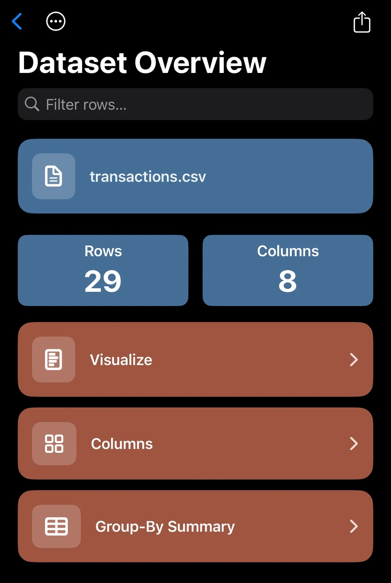
For this walkthrough, I used a CSV statement from a month when I barely touched my credit card. As soon as the file loads, you are presented with the row and column count, along with a preview of the first rows neatly displayed as tiles. A quick filter bar at the top helped me zero in on transactions, and a long press on any row allowed me to copy it as CSV, JSON, or even key-value pairs. Handy if I need to send details elsewhere.

But the real fun began when I moved into the Visualizations tab.
Visualizing Spending
I began by creating a histogram of my transaction amounts. With adjustable bins and the option to choose between relative frequency and percentages, it quickly became clear that most of my purchases were under $27. That lined up with my memory: a handful of small, forgettable swipes.

RowSwift also summarizes each numeric column with quick statistics, such as the mean and standard deviation. For my spending that month, the average was $24.40 with a standard deviation of $34. Not terrible.
To dig deeper, I switched over to the grouping tab. By organizing transactions by category, I could see how much I spent on groceries, restaurants, transportation, and, the obvious winner, shopping. The culprit? Pokémon cards. Not surprised.
Still, the most frequent category wasn’t shopping but restaurants, with over 50% of the transactions bearing this label. The pie chart below confirms it. What the data doesn’t say (unless you look at the actual merchant) is that, in reality, these entries were mostly from the bakeries and coffee shops that provided me the sweet boost I craved while coding the app.

What’s Next?
RowSwift was born from a simple curiosity and an interest in learning something new. Honestly, I never expected to have so much fun building it. Now that it’s live on the App Store, I plan to continue adding in practical techniques from the data world, including more statistics such as median and grouped standard deviation, richer charts, and diverse export options.
At the time of writing, the app is free to use and does not contain any ads.
Learnings
Way too many.
As someone with limited mobile development experience (and none at all on iOS), diving into a new language and the intricacies of Apple’s ecosystem was both cool and frustrating.
One of the biggest challenges? UI and UX design. Being an iPhone user didn’t mean I knew how to design for iOS. Once I decided to upgrade the project from “just a toy” to a real app, I hit a wall. I started sketching ideas on paper. Didn’t help; too abstract and no colors. Then I tried using Canva and similar design tools, but all the clicking got in the way. Eventually, I went back to something more familiar: Photoshop. I designed a tile-based layout that reminded me of my earliest days building apps for Windows 8. It felt right. Translating that design into SwiftUI was the next step.
Coding with SwiftUI went better than expected. Yes, there was a lot of Googling, a lot of poring over documentation, and many long conversations with ChatGPT to sanity-check ideas, ask whether I was following best practices, solve bugs, and help me understand error messages—thinking of “The compiler is unable to type-check this expression in reasonable time” still haunts me. However, once I wrapped my head around a few NavigationStack, things started to click.
The real beast was creating the charts. That was a different level of frustration. Half the time, I wasn’t even sure if what I wanted to do was possible in the framework. And just when I thought I was done—plot complete, interactions working (yay!)—I decided to add chart exporting. That’s when I (and the app) almost broke. Sizes were wrong, colors were off, font was too small, and data was missing. It was a disaster. But somehow, it all came together, and I was able to finish it.
Which brings me to marketing. The app is done… now what? I didn’t plan that far ahead. I’m still figuring this part out. I built this for the challenge, learning, and to count CSV rows. But of course, I’d love it if the app ended up helping someone else, too.
I’m not sure how I’ll get the word out just yet, but maybe this write-up is a good first step.
You can download RowSwift at https://apps.apple.com/us/app/rowswift/id6749399145.
For more information, visit https://rowswift.com.