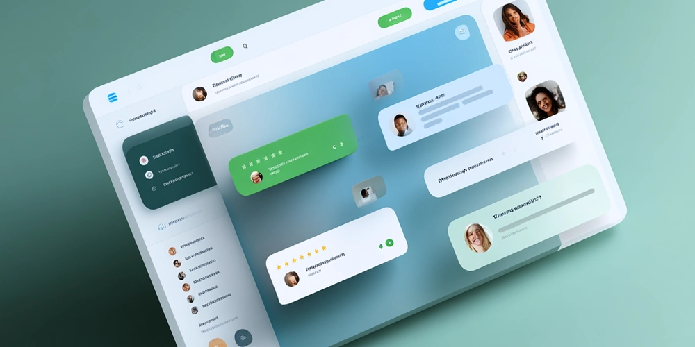
A visually appealing Zendesk Help Center is more than just a support page — it’s the digital face of your brand’s customer experience. When users visit your help center, they expect clarity, consistency, and intuitive navigation. A well-designed layout doesn’t just look good — it reduces frustration, improves findability, and increases customer satisfaction.
According to Adobe’s 2024 Digital Trends Report, 73% of users say they are more likely to trust a business that offers a visually consistent and user-friendly support experience. For companies using Zendesk, visual design plays a key role in shaping that perception.
In this article, we’ll explore actionable best practices for building a beautiful, functional, and high-performing Zendesk Help Center — one that aligns with your brand and delights your customers.
🧭 Establish a Clear Visual Hierarchy
Your Zendesk Help Center should be visually organized so users can scan and find what they need instantly. Good visual hierarchy ensures that important elements — like search bars, categories, and call-to-action buttons — stand out naturally.
Tips to Create a Clear Hierarchy
- Prioritize search visibility: Place your search bar prominently above the fold.
- Use consistent typography: Choose 2–3 complementary fonts max.
- Emphasize key actions: Use color contrast and spacing to guide the user’s eye.
- Maintain consistent spacing: Use white space strategically to prevent visual clutter.
✅ Pro Tip: Zendesk’s built-in themes allow CSS customization. Use this flexibility to highlight content sections or article categories visually.
🎨 Align Design with Brand Identity
Your help center should feel like an extension of your main website. A consistent brand experience builds trust and reinforces brand recall.
Ways to Keep Brand Consistency
- Use brand colors and logo: Stick to your brand palette, but ensure readability.
- Apply uniform icons and graphics: Visual consistency helps users recognize patterns.
- Maintain tone and style: Align article tone and visual style with your brand voice.
According to Lucidpress, maintaining brand consistency across digital touchpoints can increase revenue by up to 23%.
⚙️ Optimize for User Experience (UX)
Visual appeal should never come at the cost of usability. A good Zendesk Help Center balances aesthetics with intuitive navigation.
Key UX Best Practices
- Keep navigation simple: Limit top-level categories (ideally 5–7).
- Leverage breadcrumbs: Help users understand where they are.
- Ensure responsive design: Optimize for mobile and tablet.
- Highlight popular articles: Use “Top Articles” or “Trending Topics.”
- Enable smart search: Use Zendesk’s search analytics to refine content.
✅ Pro Tip: Use Zendesk’s Guide Custom Themes to add icons or hover effects.
🖼️ Use Visual Content to Simplify Complex Information
Humans process visuals 60,000x faster than text (Visual Teaching Alliance). Adding visuals to your Zendesk articles makes learning faster and easier.
Effective Visual Elements to Include
- Screenshots with annotations for tutorials.
- Short explainer videos for onboarding.
- Infographics to summarize workflows.
- Illustrations and icons to help users recognize topics.
✅ Pro Tip: Always include ALT text for images (e.g., “Zendesk Help Center category layout screenshot”) — this boosts accessibility and SEO.
⚡ Enhance Accessibility and Readability
An appealing Zendesk Help Center should also be inclusive. Accessibility improves both usability and compliance with WCAG 2.1.
Accessibility Guidelines to Follow
- Maintain a contrast ratio of at least 4.5:1.
- Use semantic HTML for structure.
- Enable keyboard navigation for all elements.
- Provide transcripts for videos.
✅ Pro Tip: Adjust CSS for better font size, line height, and focus states.
🧩 Leverage Custom Themes and Layouts
Zendesk allows full customization using HTML, CSS, and JavaScript. A custom theme can make your Help Center stand out.
Customization Ideas
- Add category icons for visual navigation.
- Use sticky headers for search access.
- Implement dynamic breadcrumbs or progress bars.
- Add micro-animations for smooth transitions.
You can explore pre-designed Zendesk themes that are SEO-friendly and visually aligned with modern UX trends.
🌍 Optimize for SEO, GEO, and AEO
A visually appealing Zendesk Help Center should also be search-optimized — for both Google and internal Zendesk search.
SEO and AEO Tips
- Use meta titles and descriptions with keywords.
- Add structured data (Schema.org) for rich snippets.
- Optimize images with descriptive ALT text.
- Include GEO keywords if your support is region-specific.
- Leverage Zendesk Guide SEO settings to manage sitemap visibility.
✅ Pro Tip: Integrate your Zendesk Help Center with Google Search Console to track performance.
💬 Test, Measure, and Improve
Design is an ongoing process. Once your Help Center is live, monitor performance and refine regularly.
Key Metrics to Track
- Bounce rate: Indicates if users find what they need.
- Search terms report: Reveals content gaps.
- Article views and satisfaction scores: Measure relevance.
- Session heatmaps: Show where users click or drop off.
Regularly update visuals, structure, and layout based on real data.
🧠 FAQ
Q1. How can I customise my Zendesk Help Centre without coding?
Use Zendesk’s Guide Theme Customizer to edit layouts and colors easily.
Q2. What image size works best?
Stick to 800–1200px width for clarity without affecting load time.
Q3. Can I make my Help Centre multilingual?
Yes, Zendesk supports multiple languages and locale-based templates.
Q4. How often should I update my design?
Every 6–12 months, or whenever your brand or product design changes.
🎯 Conclusion
A well-designed Zendesk Help Centre is more than a support tool — it’s an extension of your brand identity.
By focusing on visual hierarchy, UX, accessibility, and brand consistency, you can create a Help Centre that feels modern, intuitive, and helpful.
💡 Start small — even one design improvement today can make a lasting difference.


