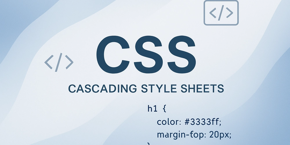
In modern web development, building responsive and visually consistent layouts is no longer a luxury—it’s a necessity. With so many screen sizes and devices to consider, developers need layout systems that are both powerful and intuitive. This is where CSS Flexbox (short for Flexible Box Layout Module) shines.
Flexbox is designed specifically for one-dimensional layouts, meaning it excels at aligning and distributing space among items in a single row or a single column. If you’ve ever struggled with floats, positioning hacks, or table-based designs, Flexbox offers a cleaner, more efficient alternative.
Why Flexbox?
Before Flexbox, developers relied heavily on floats and inline-blocks to achieve layout structures. These approaches worked but often required awkward workarounds, especially when aligning items vertically or distributing space evenly. Flexbox was introduced to tackle these problems directly, with alignment, spacing, and ordering capabilities built right into CSS.
Key benefits of Flexbox include:
- Intuitive Alignment: Both horizontal and vertical alignment become effortless.
- Responsive Design: Elements resize and adjust gracefully to fit different screen sizes.
- Space Distribution: Automatic distribution of space between, around, or within elements.
- Reordering with Ease: Change the visual order of elements without touching the underlying HTML.
The Basics: Flex Container and Flex Items
To use Flexbox, you first define a flex container. All direct children of this container become flex items.
css
.container {
  display: flex; /* turns this into a flex container */
}
Now the items inside .container can take advantage of all the Flexbox properties.
Main Axis vs. Cross Axis
Understanding axes is crucial:
- Main axis is defined by the flex-direction property (row by default).
- Cross axis is perpendicular to the main axis.
For example:
- If
flex-direction: row;, the main axis is horizontal and the cross axis is vertical. - If
flex-direction: column;, the main axis is vertical and the cross axis is horizontal.
This distinction matters when aligning or distributing items.
Core Flexbox Properties
On the Container
-
display: flex: Activates Flexbox. -
flex-direction: Defines direction (row, row-reverse, column, column-reverse). -
justify-content: Aligns items along the main axis (start, end, center, space-between, space-around, space-evenly). -
align-items: Aligns items along the cross axis (start, end, center, stretch, baseline). -
flex-wrap: Controls whether items wrap onto multiple lines.
On the Items
-
flex: Shorthand for controlling grow, shrink, and basis (flex: 1 makes items expand equally). -
align-self: Overrides align-items for individual items. -
order: Changes the visual order without altering the HTML source.
Practical Examples
Centering Content
One of the most praised features of Flexbox is the ease of centering:
css
.container {
  display: flex;
  justify-content: center;
  align-items: center;
  height: 100vh;
}
This will center any content perfectly in both axes.
Equal-Width Columns
Making columns equal in width without specifying fixed dimensions:
css
.container {
  display: flex;
}
.container div {
  flex: 1;
}
Each child will expand to share available space equally.
Responsive Navigation
Flexbox is ideal for building navigation bars that distribute space evenly:
css
nav {
  display: flex;
  justify-content: space-between;
}
This ensures your navigation links spread neatly across the available width.
When to Use Flexbox
- One-dimensional layouts: Perfect for rows or columns.
- Alignment and spacing: Whenever you need simple center alignment or space distribution.
-
Small components: Menus, cards, toolbars, forms, etc.
If you need more complex two-dimensional layouts (like full web page grids), CSS Grid is the better choice. In fact, Flexbox and Grid are complementary tools rather than competitors.
Final Thoughts
CSS Flexbox revolutionized the way we design layouts on the web. By simplifying spacing, alignment, and responsiveness, it frees developers from clunky old tricks and lets us focus on clean, maintainable CSS. Whether you’re centering a single button or building an adaptive navbar, Flexbox provides the tools to do it with minimal fuss.
Check out the YouTube Playlist for great CSS content for basic to advanced topics.
Please Do Subscribe Our YouTube Channel for clearing programming concept and much more …CodenCloud