
This drawing originated from a conversation on social media (it is visible a few times at the beginning of the video). Sarah Frisk shared an animated GIF of a cute bunny with a joyful expression while the world burns behind it. And I thought, “Wouldn’t it be cool to draw something like that in CSS?” My cartoon is way off, but an attempt was made… and it was fun!
Time-lapse of me live coding some CSS Art. This time, a rabbit bringing chaos:
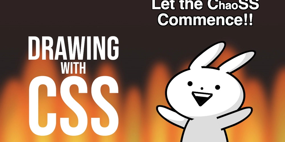
In this cartoon:
-
position: relative and absolute for… well, positioning things… and also to keep some text from flying away (ChaoSS). -
border-radius: used to create basically all the shapes, from ears to hands, from head to body. -
clip-pathandmask: to add open spaces in the headline and crop the mouth. -
background: to provide color and shadows for every element. -
text-shadow: not a super common one for CSS art, in this cased, used to add a border to the text… but then the text ended up over a dark background and didn’t need an outline 😅😓 -
filterandanimation: to create some fake flames and add a shaking motion to the creature (a rabbit?). -
random(): still unsupported by most browsers, but there’s a fallback so it works fine. It’s used to generate different flame sizes, making the drawing slightly “different” every time it loads.
Here’s the source code and live demo:
(It is not animated by default. To make it move, remove the “no-animated” class… at your own peril)
There is a second version of the cartoon that fixes some of the things and adds extra animation while using the @property rule.