A modal popup is a dialog box that appears on top of the page content to grab the user’s attention. It’s used for tasks like asking for confirmation, displaying messages, or showing forms without taking the user to a different page.
If you’ve been working with Bootstrap, you know how easy it is to use their pre-built components. The modal popup is one of them. It’s responsive, customizable, and can be styled to fit any project, whether you’re working on a simple form or a complex UI.
In this guide, we’ll break down how Bootstrap modals work, how to use them, and how to customize them to meet your needs.
Getting Started with Bootstrap
Before you can use a Bootstrap modal, you need to include the Bootstrap library in your project. You can do this either by using CDN or npm.
CDN Setup:
Here’s how you can link the Bootstrap styles and script using a CDN:
<link href="https://cdn.jsdelivr.net/npm/bootstrap@5.3.3/dist/css/bootstrap.min.css" rel="stylesheet">
<script src="https://cdn.jsdelivr.net/npm/bootstrap@5.3.3/dist/js/bootstrap.bundle.min.js">script>
NPM Setup:
Alternatively, you can install it via npm if you’re using a build system:
npm install bootstrap
Once included, you’re ready to start using Bootstrap’s modals!
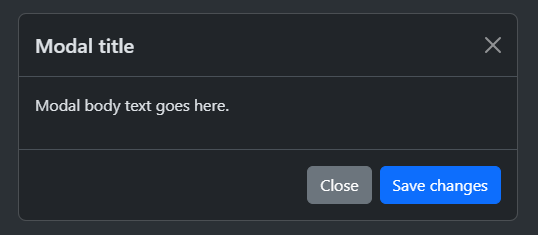
Basic Modal Structure
Bootstrap’s modal follows a simple structure. Here’s a basic modal with all the necessary elements:
<!-- Button trigger modal -->
<!-- Modal -->
class="modal fade" id="exampleModal" tabindex="-1" aria-labelledby="exampleModalLabel" aria-hidden="true">
class="modal-dialog">
class="modal-content">
class="modal-header">
class="modal-body">
Modal body text goes here.
class="modal-footer">

Key components:
-
modal: The container element -
modal-dialog: Wraps the modal content and positions it -
modal-content: The box where your content goes -
modal-header,modal-body,modal-footer: These divide your modal into sections for title, content, and action buttons.
For further details consider checking Bootstrap Modal PopUp Example by Sneat Bootstrap Admin Template. It is by far one of the best Bootstrap Templates for developers for building responsive web apps easily.

Triggering the Modal
There are two common ways to open a modal: using data attributes or the JavaScript API.
Using Data Attributes
- This is the easiest method. You just need to add
data-bs-toggle="modal"anddata-bs-target="#yourModalId"to the button or link you want to use to open the modal.
Using JavaScript
- For more control (like when you need to open the modal programmatically), use the JavaScript API:
const modal = new bootstrap.Modal(document.getElementById('exampleModal'));
modal.show();
Modal Variations
Bootstrap offers a few variations of modals to make them more versatile for different use cases.
Static Backdrop
By default, you can close the modal by clicking outside of it. If you want to prevent that (e.g., for confirmation modals), use the data-bs-backdrop="static" option:
...
Scrollable Modal
If your modal content is too long, you can make just the body scrollable:
class="modal-dialog modal-dialog-scrollable"> ...
Centered Modal
To center your modal vertically on the screen, use the modal-dialog-centered class:
class="modal-dialog modal-dialog-centered"> ...
Fullscreen Modal
If you want the modal to take up the full screen, you can use the modal-fullscreen class:
class="modal-dialog modal-fullscreen"> ...
Customizing Your Modal
While Bootstrap provides great default styling, you can easily customize your modals for a unique look.
Modal Sizes
Bootstrap offers pre-defined classes for small, large, and extra-large modals:
class="modal-dialog modal-sm"> ...
class="modal-dialog modal-lg"> ...
Styling
You can easily override the modal’s .modal-content class for different themes, borders, or even backgrounds..
Animations
Bootstrap modals come with a fade animation. You can modify or replace this with your own custom animations.
Modal Events
Bootstrap modals also provide event hooks that are useful for triggering actions before or after a modal opens or closes. You can listen for events like show.bs.modal or hidden.bs.modal.
const modalElement = document.getElementById('exampleModal');

modalElement.addEventListener('show.bs.modal', () => {
  console.log('Modal is about to open');
});

modalElement.addEventListener('hidden.bs.modal', () => {
  console.log('Modal has been closed');
});
These events are perfect for dynamic content loading or performing actions based on user interaction.
Adding Dynamic Content
If you want to pass data into your modal dynamically (like editing user information), you can use JavaScript events.
For example, let’s say you want to edit a user’s info in the modal:
In the JavaScript code:
const editUserModal = document.getElementById('editUserModal');
editUserModal.addEventListener('show.bs.modal', event => {
  const button = event.relatedTarget;
  const userId = button.getAttribute('data-bs-id');
  editUserModal.querySelector('.modal-body input').value = userId;
});
This lets you inject dynamic data into the modal every time it opens.
Best Practices for Using Modals
- Don’t overuse modals: They should serve specific purposes like login, confirmation, or quick alerts. Avoid using them for entire forms or long content.
- Ensure accessibility: Use ARIA attributes and ensure the modal is accessible to screen readers. Bootstrap handles most of this automatically, but always test with screen readers.
- Use programmatic control: Use the JavaScript API to open and close modals when necessary for smoother user experiences.
- Mobile-first approach: Make sure the modal works well on mobile. The fullscreen modal class is especially helpful for small screens.
Common Issues and Solutions
Modal Not Closing
- If your modal isn’t closing, check that your dismiss buttons are correctly set up with
data-bs-dismiss="modal".
Scrolling Issues
- Sometimes, especially on mobile, you might notice background scrolling even when the modal is open. Make sure to use the
modal-backdropclass properly, or adjust your CSS to prevent it.
Nested Modals
- Avoid nesting modals inside other modals as it can lead to poor user experience and tricky issues with focus and modal stacking.
Real-World Examples
Here are some common examples of modal use cases:
- Login Modals: Quick authentication without leaving the page.
- Confirmation Modals: Ask the user if they’re sure they want to delete something.
- Image Lightboxes: Open a larger version of an image in a modal for better viewing.
- Form Modals: Gather user input without redirecting to another page.
Conclusion
Bootstrap modals are a powerful tool that adds interactivity and enhances user experience in your web applications. With simple markup and minimal code, you can create responsive, customizable modals that are fully accessible and fit perfectly into your design.
By combining Bootstrap’s data API and JavaScript API, you can trigger modals dynamically and pass content seamlessly, making them highly adaptable for different needs.
For more information, check out the official Bootstrap modal docs.