Read the original article:Practical Guide: Mastering Custom Gaussian Blur Pop-ups in HarmonyOS
Contents
-
Preface
-
Feature Demonstration
-
Complete Solution
- 1. Data Structure Definition
- 2. Core Technology Analysis
- Precise Positioning Technology
- Additional Knowledge Points
- Gaussian Blur Effect
- Visual Design Concept
- 3. Usage Guide
-
Summary and Outlook
Preface
Hello everyone, I am Ruocheng. This series is dedicated to helping developers quickly implement commonly used features in HarmonyOS apps, providing ready-to-use code examples.
While previous articles mainly focused on functional implementation at the application level, this time we will shift our perspective to the essence of UI interaction design — a complete solution for creating a custom Gaussian blur pop-up. Without further ado, let us get started.
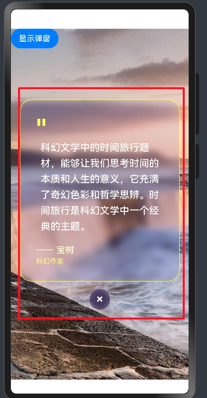
Feature Demonstration
In this article, we will implement a highly customizable pop-up component with the following characteristics:
- Gaussian blur background:Creates a modern frosted glass visual effect
- Fully customizable content:Supports any layout or content structure
- Elegant transition animations:Provides smooth show/hide transition effects
- Beautiful close button:Allows one-click closure for a user-friendly experience
- Wide applicability:Suitable for various content display scenarios

Complete Solution
1. Data Structure Definition
Defining the Data Type
interface Poem {
    _id: string;
    date: string;
    author: string;
    content: string;
    from: string;
    like: number;
    pic_url: ResourceStr;
    share: number;
    thumb: ResourceStr;
}
Defining Related Data
   @State wallpaperData: Poem =   {
        "_id": "c4ee5e1ec8bc480b8df05428",
        "date": "20250814",
        "author": "Baoshu",
        "content": "Time travel in science fiction allows us to reflect on the nature of time and the meaning of life. It blends imagination with philosophy. Time travel is a classic theme in science fiction. ",
        "from": "Science fiction writer",
        "like": 220,
        "share": 351,
        "pic_url": $r('app.media.20250818'),
        "thumb": $r('app.media.20250818')
    }
Defining the Pop-up State Variable and Toggle Function
 @State showDialog: boolean = false;

 handleShow=()=>{
        this.showDialog = !this.showDialog
    }
Core Code of the Gaussian Blur Pop-up
            if (this.showDialog) {
                Column() {
                    // Quote content card
                    Column() {
                        // Quotation mark decoration
                        Text('"')
                            .fontSize(48)
                            .fontColor('#FFFFFF60')
                            .fontWeight(FontWeight.Bold)
                            .alignSelf(ItemAlign.Start)
                            .margin({ bottom: -10 })

                        Text(this.wallpaperData.content)
                            .fontSize(20)
                            .fontColor(Color.White)
                            .lineHeight(32)
                            .textAlign(TextAlign.Start)
                            .fontWeight(FontWeight.Medium)
                            .margin({ bottom: 24 })

                        // Author information
                        Row() {
                            Column() {
                                Text(`—— ${this.wallpaperData.author}`)
                                    .fontSize(18)
                                    .fontColor('#FFFFFFCC')
                                    .fontWeight(FontWeight.Medium)
                                Text(this.wallpaperData.from)
                                    .fontSize(14)
                                    .fontColor('#FFFFFF80')
                                    .margin({ top: 4 })
                            }
                            .alignItems(HorizontalAlign.Start)
                            .layoutWeight(1)


                        }
                        .width('100%')
                        .alignItems(VerticalAlign.Bottom)
                    }
                    .width('100%')
                    .padding(32)
                    .backgroundColor('#1A1A1AE6')
                    .borderRadius(24)
                    .backdropBlur(30)
                    .border({ width: 1, color: '#FFFFFF30' })
                    .shadow({
                        radius: 20,
                        color: '#00000060',
                        offsetX: 0,
                        offsetY: 8
                    })

                    // Close button
                    Button() {
                        Text('×')
                            .fontSize(24)
                            .fontColor('#FFFFFF')
                            .fontWeight(FontWeight.Bold)
                    }
                    .width(40)
                    .height(40)
                    .backgroundColor('#FF453A60')
                    .borderRadius(20)
                    .backdropBlur(20)
                    .border({ width: 1, color: '#FF453A80' })
                    .shadow({
                        radius: 6,
                        color: '#FF453A30',
                        offsetX: 0,
                        offsetY: 2
                    })
                    .margin({ top: 16 })
                    .onClick(() => {
this.handleShow()


                    })
                }
                .width('90%')
                .justifyContent(FlexAlign.Center)
                .position({ x: '50%', y: '50%' })
                .translate({ x: '-50%', y: '-50%' })
                .transition({
                    type: TransitionType.All,
                    opacity: this.showDialog ? 1 : 0,
                    scale: { x: this.showDialog ? 1 : 0.8, y: this.showDialog ? 1 : 0.8 }
                })
            }
2. Core Technology Analysis
The above code represents the complete implementation of the pop-up component. Next, let us break down its three key technical highlights:
Precise Positioning Technology
The pop-up achieves perfect centering through absolute positioning combined with the translate attribute:
 .position({ x: '50%', y: '50%' })
 .translate({ x: '-50%', y: '-50%' })
  .transition({
                    type: TransitionType.All,
                    opacity: this.showDialog ? 1 : 0,
                    scale: { x: this.showDialog ? 1 : 0.8, y: this.showDialog ? 1 : 0.8 }
                })
Additional Knowledge Points
To display the pop-up with animation, add the following event to the button that triggers it:
 Button('Display Pop-up').onClick(()=>{
                animateTo({
                    duration: 400,
                    curve: Curve.EaseInOut
                }, () => {
                    this.handleShow()
                })

            })
This works perfectly for displaying the pop-up. However, the hide animation is not yet supported in this solution. Feel free to share better solutions in the comments.
Gaussian Blur Effect
The frosted glass effect is achieved through the following style attributes:
 .backgroundColor('#1A1A1AE6')
                    .borderRadius(24)
                    .backdropBlur(30)
                    .border({ width: 1, color: '#FFFFFF30' })
                    .shadow({
                        radius: 20,
                        color: '#00000060',
                        offsetX: 0,
                        offsetY: 8
                    })
Attribute description:
- backgroundColor: Sets a semi-transparent dark gray background (#1A1A1AE6) to create immersion
- borderRadius: Sets a 24vp corner radius for a modern appearance
- backdropBlur: Applies a 30vp background blur, producing the classic frosted-glass effect and enhancing visual depth
- shadow: Adds a soft shadow below the card for a floating and layered look
Visual Design Concept
The clever combination of these style attributes results in a modern frosted-glass pop-up:
| Design Element | Effect Achieved | User Experience |
|---|---|---|
| Semi-transparent background + blur | Frosted glass texture | Rich visual layering |
| Rounded corners + subtle border | Modern look | Softer, elegant interface |
| Shadow effect | Floating 3D feeling | Enhanced spatial perception |
| Proper padding | Comfortable layout | Improved readability |
3. Usage Guide
Add a trigger button to the page and call the handleShow() function in its click event to toggle the pop-up’s visibility.
Summary and Outlook
This pop-up component is highly reusable and customizable. Developers can easily adjust the style parameters and content structure according to specific project requirements. That is exactly why I created this component. I hope it helps you. Alright, class dismissed.