
The Architecture Dilemma Every Vue Developer Faces
You’ve been there: your Vue 3 project starts beautifully organized, but after a few sprints, finding the right component feels like searching for a needle in a haystack. Your components folder has 47 files, your utils folder is a graveyard of functions nobody understands, and that store directory? Let’s not even go there.
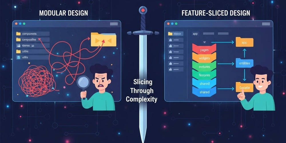
The question isn’t whether you need architecture—it’s which one. Today, we’re diving deep into two popular approaches: traditional Modular Design and the increasingly popular Feature-Sliced Design (FSD). Both promise scalability, but they take radically different paths to get there.
What is Modular Design?
Modular Design is the OG approach most Vue developers know and love. It’s all about organizing code by technical concerns—grouping similar types of files together regardless of what feature they belong to.
The Classic Structure
src/
├── components/
│   ├── UserAvatar.vue
│   ├── UserProfile.vue
│   ├── ProductCard.vue
│   ├── ProductList.vue
│   └── ShoppingCart.vue
├── composables/
│   ├── useAuth.ts
│   ├── useProducts.ts
│   └── useCart.ts
├── stores/
│   ├── auth.ts
│   ├── products.ts
│   └── cart.ts
├── services/
│   ├── api.ts
│   ├── authService.ts
│   └── productService.ts
├── utils/
│   ├── formatters.ts
│   └── validators.ts
└── views/
    ├── HomePage.vue
    ├── ProductPage.vue
    └── CheckoutPage.vue
The Modular Philosophy
“Group by what it is, not what it does.”
Modular Design follows the principle of separation by layer. Components live with components, stores with stores, and utilities with utilities. It’s intuitive for developers coming from traditional MVC backgrounds and feels natural when you’re building small to medium applications.
Strengths of Modular Design
1. Low Entry Barrier
New developers can jump in immediately. Need a component? Check the components folder. Need state management? Look in stores. The mental model is straightforward.
2. Easy Code Discovery
When everything of the same type lives together, you know exactly where to look. No guessing games about which feature folder contains the mixin you need.
3. Promotes Reusability
Since components aren’t tied to specific features, developers naturally think about making them reusable. Your Button.vue can be used anywhere.
4. Works Great for Small Teams
When you have 2-5 developers, everyone can keep the entire codebase in their head. The simpler structure reduces cognitive overhead.
The Dark Side of Modular Design
But here’s where things get messy as your app grows:
1. The Coupling Nightmare
Your UserProfile.vue imports from useAuth, which imports from authStore, which imports from authService, which imports utilities from three different files. Change one thing, and you’re playing whack-a-mole with bugs.
2. Feature Hunting
Want to understand how checkout works? Good luck. You’ll need to jump between CheckoutPage.vue, ShoppingCart.vue, useCart.ts, cart.ts in stores, and orderService.ts. The feature is scattered across the entire codebase.
3. Folder Explosion
Your components folder now has 200+ files. Half are generic, half are feature-specific, and nobody knows which is which. Finding anything requires Cmd+P and prayer.
4. Refactoring Hell
Removing a feature means hunting through every layer of your app. Miss one store import? Enjoy your runtime errors.
Enter Feature-Sliced Design
Feature-Sliced Design (FSD) flips the script entirely. Instead of organizing by technical layer, it organizes by business domain and scope.
The FSD Structure
src/
├── app/
│   ├── providers/
│   ├── styles/
│   └── index.ts
├── pages/
│   ├── home/
│   ├── product/
│   └── checkout/
├── widgets/
│   ├── header/
│   ├── product-list/
│   └── shopping-cart/
├── features/
│   ├── auth/
│   │   ├── ui/
│   │   │   ├── LoginForm.vue
│   │   │   └── LogoutButton.vue
│   │   ├── model/
│   │   │   ├── store.ts
│   │   │   └── types.ts
│   │   └── api/
│   │       └── authApi.ts
│   ├── add-to-cart/
│   │   ├── ui/
│   │   │   └── AddToCartButton.vue
│   │   ├── model/
│   │   │   └── store.ts
│   │   └── api/
│   └── product-filter/
├── entities/
│   ├── user/
│   │   ├── ui/
│   │   │   ├── UserAvatar.vue
│   │   │   └── UserCard.vue
│   │   ├── model/
│   │   │   ├── store.ts
│   │   │   └── types.ts
│   │   └── api/
│   └── product/
│       ├── ui/
│       │   └── ProductCard.vue
│       ├── model/
│       │   ├── store.ts
│       │   └── types.ts
│       └── api/
└── shared/
    ├── ui/
    │   ├── Button.vue
    │   └── Input.vue
    ├── lib/
    │   └── utils.ts
    └── api/
The FSD Philosophy
“Group by scope and impact, enforce strict isolation.”
FSD introduces layers (app, pages, widgets, features, entities, shared) that represent different levels of abstraction. Each slice is self-contained with its own UI, business logic, and API layer.
The Core Principles
1. Layers Have Hierarchy
-
app: Global setup, providers, routing -
pages: Route-level components -
widgets: Large composite UI blocks -
features: User interactions (business features) -
entities: Business domain models -
shared: Generic reusable code
2. Import Rules (The Secret Sauce)
Code can only import from layers below it or the same layer. A feature can use entities and shared, but not other features. This prevents the tangled web of dependencies that plague modular designs.
3. Public API Pattern
Each slice exports only what’s needed through an index.ts. Internal implementation stays hidden. Change internals freely without breaking consumers.
Real Vue 3 Example: Add to Cart Feature
Modular Design approach:
<script setup lang="ts">
import { useCartStore } from '@/stores/cart'
import { useProducts } from '@/composables/useProducts'
import { trackEvent } from '@/utils/analytics'
import { showToast } from '@/utils/notifications'

const props = defineProps<{ productId: string }>()
const cartStore = useCartStore()
const { getProduct } = useProducts()

const addToCart = async () => {
  const product = await getProduct(props.productId)
  cartStore.addItem(product)
  trackEvent('add_to_cart', { productId: props.productId })
  showToast('Added to cart!')
}
script>
FSD approach:
features/
└── add-to-cart/
    ├── ui/
    │   └── AddToCartButton.vue
    ├── model/
    │   ├── useAddToCart.ts
    │   └── types.ts
    ├── api/
    │   └── addToCartApi.ts
    └── index.ts
<script setup lang="ts">
import { useAddToCart } from '../model/useAddToCart'
import { Button } from '@/shared/ui'
const props = defineProps<{ productId: string }>()
const { addToCart, isLoading } = useAddToCart()
const handleClick = () => addToCart(props.productId)
script>
<template>
template>
// features/add-to-cart/model/useAddToCart.ts
import { ref } from 'vue'
import { useCartStore } from '@/entities/cart'
import { trackEvent } from '@/shared/lib/analytics'
import { showToast } from '@/shared/ui/toast'

export const useAddToCart = () => {
  const isLoading = ref(false)
  const cartStore = useCartStore()

  const addToCart = async (productId: string) => {
    isLoading.value = true
    try {
      await cartStore.addItem(productId)
      trackEvent('add_to_cart', { productId })
      showToast('Added to cart!')
    } finally {
      isLoading.value = false
    }
  }

  return { addToCart, isLoading }
}
// features/add-to-cart/index.ts
export { default as AddToCartButton } from './ui/AddToCartButton.vue'
export { useAddToCart } from './model/useAddToCart'
The Showdown: Feature by Feature
1. Scalability
Modular Design: ⭐⭐⭐
Works well up to ~50 components and ~20 routes. Beyond that, cognitive load skyrockets. You’ll spend more time navigating than coding.
Feature-Sliced Design: ⭐⭐⭐⭐⭐
Designed for scale. Add 100 features? No problem. Each feature is isolated. Your features folder might be huge, but each slice is small and focused.
2. Team Collaboration
Modular Design: ⭐⭐⭐
Merge conflicts are common. Everyone touches the same folders. Two developers working on different features will both modify components/ and stores/.
Feature-Sliced Design: ⭐⭐⭐⭐⭐
Features are isolated. Team members rarely work in the same slice. Pull requests are cleaner. Code reviews focus on business logic, not file organization.
3. Learning Curve
Modular Design: ⭐⭐⭐⭐⭐
Junior developers get it immediately. It maps to familiar patterns. “Where’s the button component? In the components folder, duh.”
Feature-Sliced Design: ⭐⭐⭐
Steeper curve. Developers need to understand layers, import rules, and the public API pattern. Takes 1-2 weeks to internalize. Documentation is crucial.
4. Code Reusability
Modular Design: ⭐⭐⭐⭐
Easy to reuse components since they’re centralized. However, you’ll create “god components” that try to handle every use case.
Feature-Sliced Design: ⭐⭐⭐⭐
Reusability is intentional, not accidental. shared contains truly generic code. entities handle domain models. Features stay specific. Less generic bloat.
5. Feature Removal
Modular Design: ⭐⭐
Delete a feature? Hope you find all the pieces. Check components, stores, composables, services, utils, and pray you didn’t break something else.
Feature-Sliced Design: ⭐⭐⭐⭐⭐
Delete the folder. That’s it. Thanks to strict isolation and public APIs, removing a feature is surgical. If it compiles, it works.
6. Testing
Modular Design: ⭐⭐⭐
Testing is straightforward but often requires mocking multiple layers. Your component test needs to mock stores, services, and utilities.
Feature-Sliced Design: ⭐⭐⭐⭐
Each slice is independently testable. Test the feature’s model layer in isolation. Test UI with a minimal setup. Less mocking, more confidence.
7. Refactoring
Modular Design: ⭐⭐
Risky. Change one composable, and you might break three features. Hard to know what’s safe to change.
Feature-Sliced Design: ⭐⭐⭐⭐
Safe. Public APIs create clear contracts. Refactor internals freely. Only breaking the public API affects consumers—and your IDE will tell you exactly where.
When to Choose What?
Choose Modular Design When:
- Your team is small (2-5 developers)
- The project is small-medium (<50 components)
- Time to market is critical (FSD has setup overhead)
- Team is junior (lower learning curve)
- The product scope is unclear (premature abstraction is dangerous)
- You’re building a proof of concept or MVP
Choose Feature-Sliced Design When:
- Your team is growing (5+ developers)
- The project is large (100+ components)
- Long-term maintenance matters (planning for 2+ years)
- Multiple teams will touch the codebase
- Feature independence is important (microservices mindset)
- You need to onboard developers frequently
The Hybrid Approach (The Secret Third Option)
Here’s what nobody tells you: you don’t have to choose. Many successful Vue 3 projects use a hybrid:
src/
├── features/              # FSD-style features
│   ├── auth/
│   └── checkout/
├── entities/              # FSD-style entities
│   ├── user/
│   └── product/
├── shared/                # FSD-style shared
│   ├── ui/
│   └── lib/
├── components/            # Modular-style global components
│   ├── layouts/
│   └── common/
└── composables/           # Modular-style global composables
    └── useMediaQuery.ts
Use FSD’s feature isolation for complex business logic, but keep a components folder for truly generic UI elements. Best of both worlds.
Migration Strategy: From Modular to FSD
Already have a modular project? Here’s how to migrate incrementally:
Phase 1: Create the structure
mkdir -p src/{features,entities,shared/{ui,lib}}
Phase 2: Move truly generic code
Move utilities and generic components to shared. This is low-risk.
Phase 3: Extract one feature
Pick a self-contained feature (authentication is often a good start). Move its components, store, and API to features/auth/. Update imports. Test thoroughly.
Phase 4: Repeat
Extract one feature per sprint. Don’t rush. The codebase will be hybrid for months—that’s fine.
Phase 5: Extract entities
Once features are out, extract domain models to entities. This is the trickiest part.
The Verdict
There’s no universal winner. Modular Design and Feature-Sliced Design optimize for different things:
- Modular Design optimizes for simplicity and speed
- Feature-Sliced Design optimizes for scalability and maintainability
For most Vue 3 projects starting today, I’d recommend:
- Start modular (launch fast)
- Monitor complexity (watch for the pain points)
- Migrate to FSD when you hit 30-50 components or 5+ developers
The best architecture is the one your team can maintain. FSD is more powerful, but Modular Design is more forgiving. Choose based on where you are, not where you hope to be.
Resources
What’s your experience with project architecture in Vue 3? Have you tried FSD? Let’s discuss in the comments!